Resource Management Redesign
A confusing, data-heavy tool was quietly causing project delays. I simplified it, on my own, in two months.
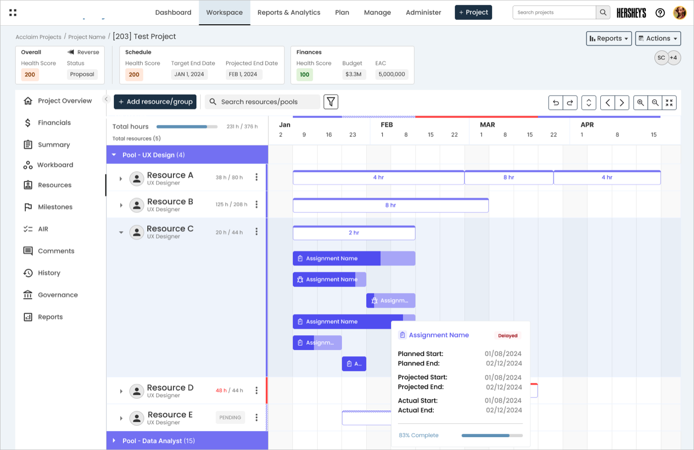
Imagine staring at a big table of numbers, doing math in your head just to figure out who's overbooked this week, then going back and forth over email to sort it out. That was daily life for the people using this tool. As the only designer on the project, I rebuilt the experience: an easier way to request and manage people's time, and clearer views that surface problems instead of burying them in data, all in two months while keeping the design consistent with a related product the company also sold. The project was paused after the company was acquired, but it's some of the work I'm proudest of.
A tool that hid the answer people actually needed
This project was part of a tool that helps companies plan people's time across projects. Two kinds of people used it: Project Managers, who requested help for their work, and Resource Managers, who decided who got assigned where. Neither could easily tell who was overloaded or free. The screens were full of numbers, but never gave a straight answer, so to ask for or hand off help, people left the software and emailed each other instead.
The company also wanted this tool to feel more like a related product it sold alongside it, so the two could be marketed as a set. That meant my redesign had to solve the real problem and fit an existing visual style.
- I was the only designer, working with four developers on a two-month deadline.
- The new design had to visually match that related product.
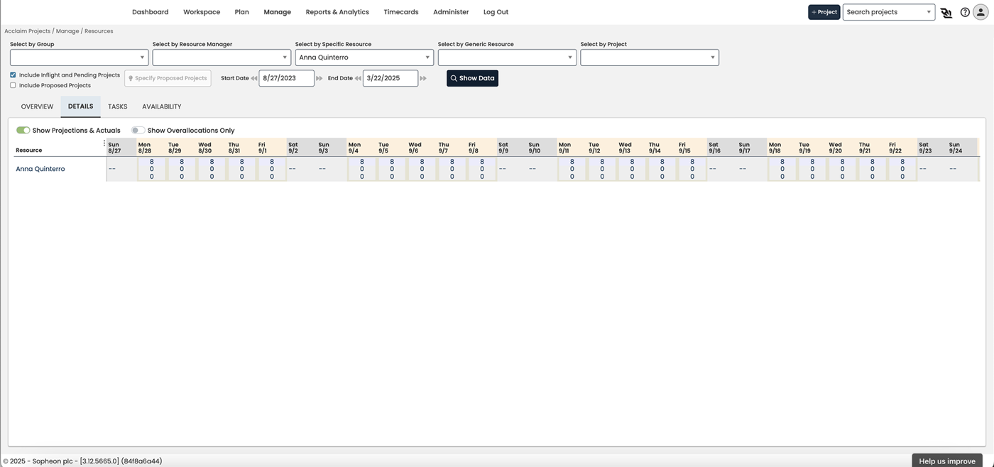
Before: Resource Management view for project managers (click to view larger)
After: Resource Management view for project managers (click to view larger)
Figuring out the problem without talking to users directly
I couldn't interview real users on this project. Instead, I talked to the product manager and lead engineer, who spoke with customers regularly and knew their frustrations well, and looked at how a few competitor tools handled similar problems. It's not how I'd choose to work ideally, but it's a common real-world constraint, and it's taught me how to get useful signal from indirect sources.
What I learned
- People weren't using the resource management feature at all because they found it too confusing and hard to navigate.
- With no built-in way to request or assign people, everyone fell back on email, which was slow and easy to get wrong.
- What people wanted most was simple: a fast way to see who's overloaded or free, without digging through data.
- Not understanding their resources' time was actively costing customers money.
Wireframing, testing, and changing course
I started with low-fidelity wireframes and reviewed them with the team early, before spending time on polish. This was before fast AI prototyping tools existed, so low-fidelity wireframes were an important way to make sure all stakeholders were aligned on what was being built before I moved into high-fidelity design. That saved me from redoing work later.
My first idea for the calendar view used custom color-coded bars to show who was over- or under-booked. The team liked it, but building it from scratch would have blown the two-month deadline. So I switched to a calendar style the company already used in its other product. It wasn't as flashy, but it solved the same problem, shipped faster, and kept the two products feeling like one family.
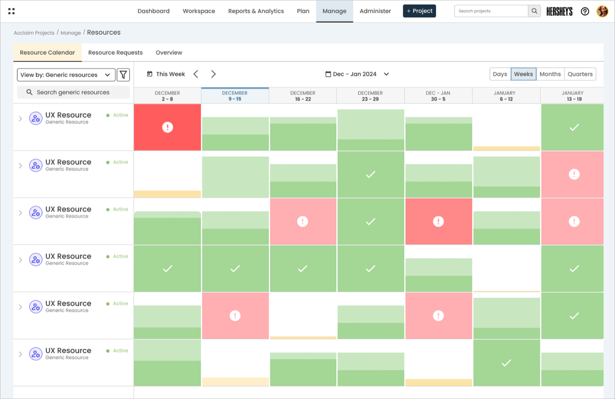
Rejected: first iteration, custom color-coded calendar (click to view larger)
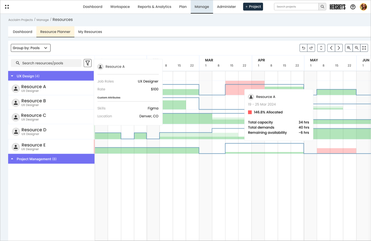
Shipped: adapted from an existing sister-product pattern (click to view larger)
The first version required too many net-new components to build in two months. The shipped version reused a pattern the sister product already had.
What the new design does
Project Managers can now request people right inside the tool instead of over email. They pick what kind of person they need (role, skills, location), see who's actually available, and split the work across more than one person if needed. Once submitted, they get a shared calendar of everyone on their project, with a built-in warning when someone's overbooked.
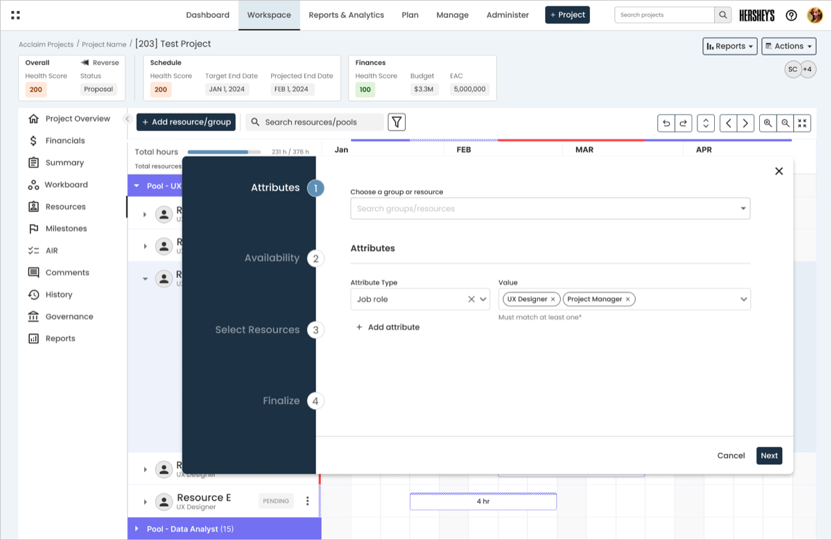
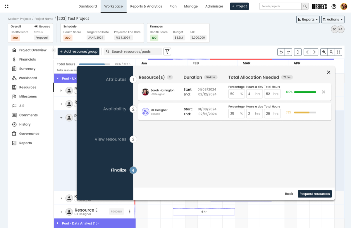
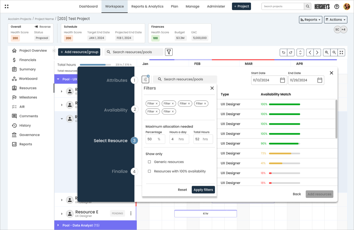
A sample of the request resources workflow. Click any photo to view it larger.
For the people managing everyone's time
Resource Managers now get a dashboard that shows who's overloaded or underused at a glance, plus a shared calendar of everyone's workload across every project. They can also open a single person's page to see their skills, availability, and current assignments in one place, instead of hunting across multiple screens.
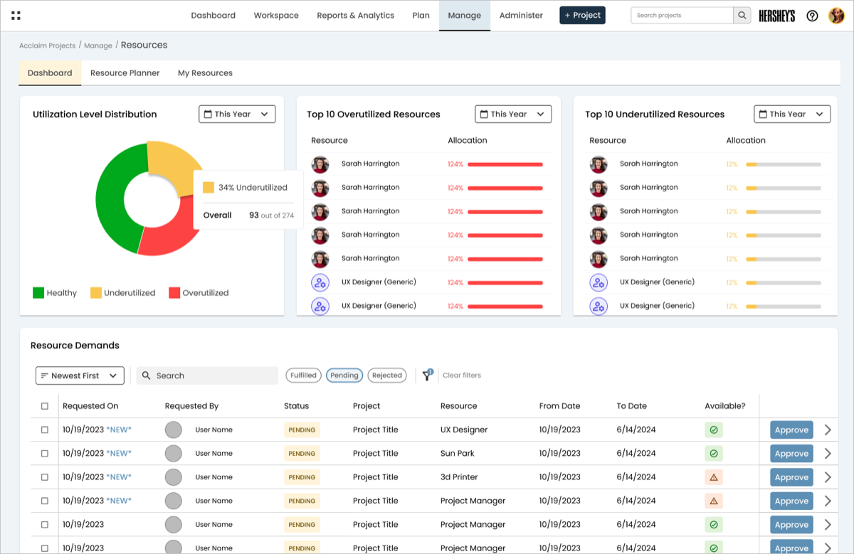
Resource Management Dashboard (click to view larger)
Resource Planner (click to view larger)
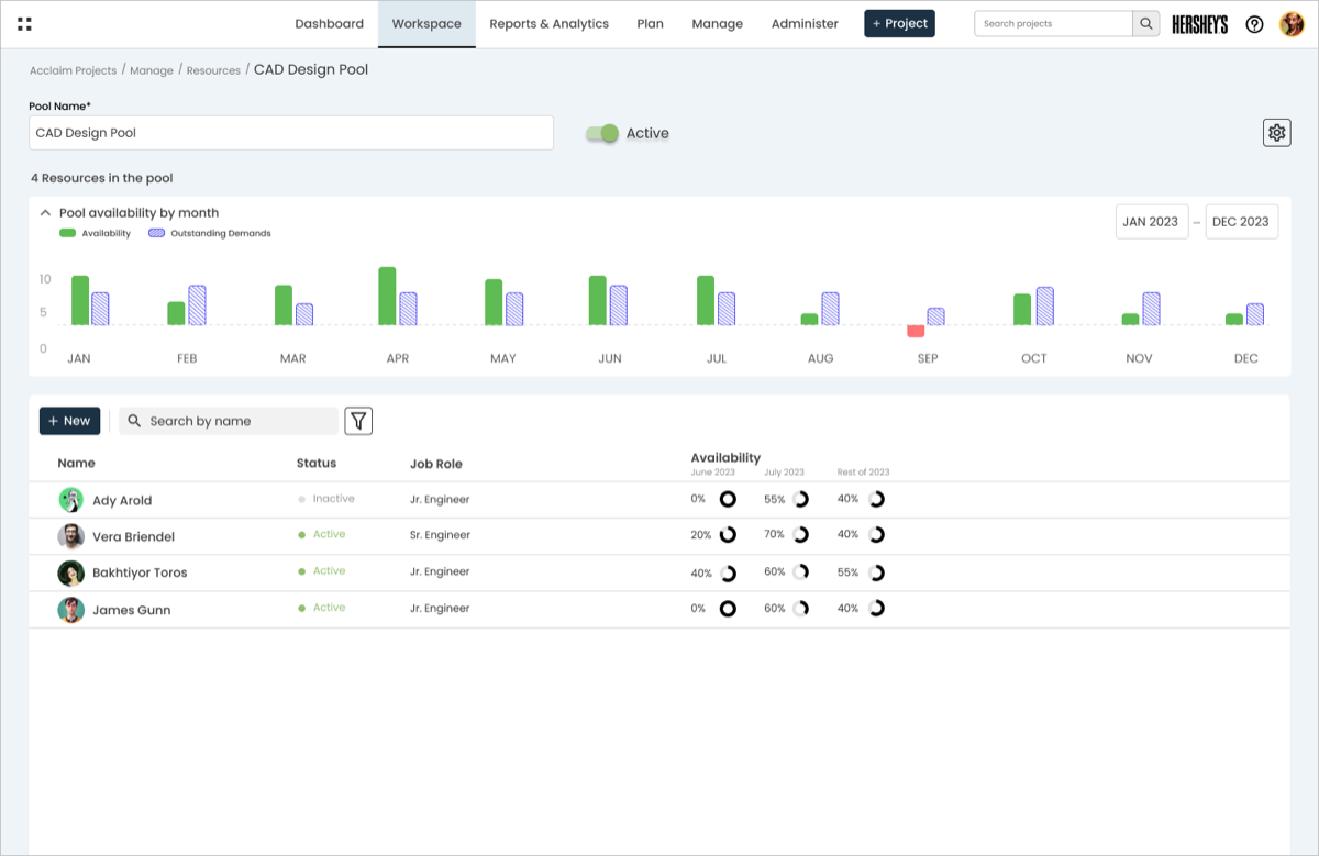
Project Manager Resource Pool View (click to view larger)
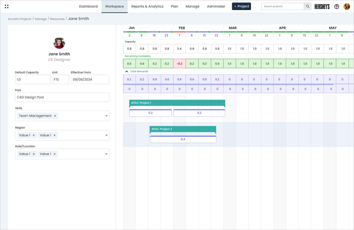
Project Management Individual Resource Calendar View (click to view larger)
What this project shows about how I work
This project didn't ship with hard numbers to report, since work paused after the company was acquired. But the process itself says a lot about how I approach design:
- I work within real limits. A tight deadline and a requirement to match another product's style shaped almost every decision, and I still found room for good design inside those limits.
- I simplify complex problems. Requesting and assigning people sounds simple, but it involves a lot of moving parts: skills, dates, splitting time across people. I built a flow that handles all of that without overwhelming the person using it.
- I'm comfortable with ambiguity. I never had direct access to users, and requirements shifted mid-project when the custom calendar turned out to be infeasible. I made confident design calls anyway with the evidence I had, and stayed ready to change course when something wasn't working.
After I finished the designs and handed them off to engineering, the company was acquired and priorities shifted, so this redesign is on hold for now. There's no usage data to share yet, but it's some of the work I'm most proud of, and I'd love to see it built.
Looking back
What I'd do differently
I'd push harder for even a little direct contact with real users, like a few short surveys or recorded sessions, instead of relying only on the product manager and engineer as stand-ins. Their input was valuable, but hearing straight from the people using the tool would have made some decisions easier to defend.
What I learned
The best solution isn't always the most original one. Giving up my custom calendar idea felt like a step back at the time, but it was the right call. It kept the project on schedule, kept the two products feeling consistent, and let the team spend its limited time on the harder problem: making it easy to request and assign people in the first place.